Book of Genesis, image 1

Book of Genesis

Is beauty a superficial distraction from God's truth, or an essential
dimension of Christian worship? The intricate ornamentation of medieval
religious manuscripts deserve more than a place in history books. This
project explores how their centuries-old visual heritage can be brought into
a contemporary Bible edition.
Book of Genesis, image 6

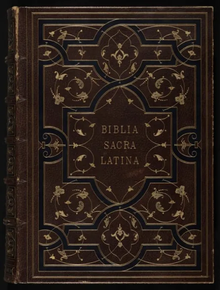
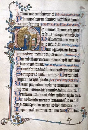
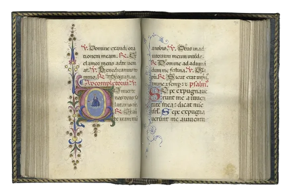
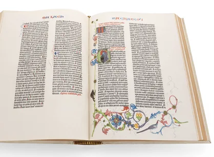
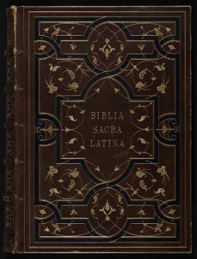
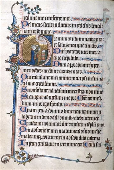
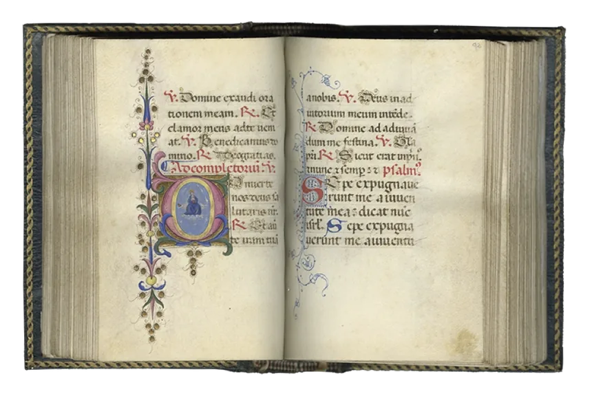
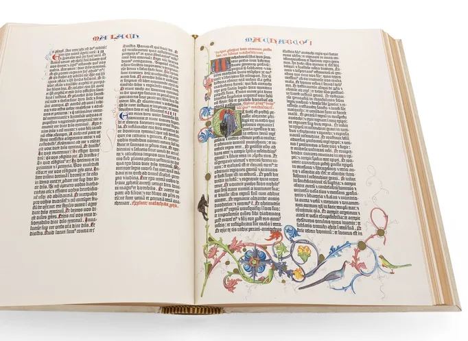
Before starting to design, I spent time exploring archives of illuminated
medieval manuscripts. I looked closely at their typography, page layouts,
ornamentation and illustrations, gradually noticing certain recurring
features: narrow text columns, ink-like gothic lettering and delicate
illustrations that used symbolism to convey entire stories.
Book of Genesis, image 9 Book of Genesis, image 10 Book of Genesis, image 12

Psalter, England,
1310-1320

Book of Genesis, image 11

Book of Hours, Italy
15th century

Gutenberg Bible, Germany,
1452-1455

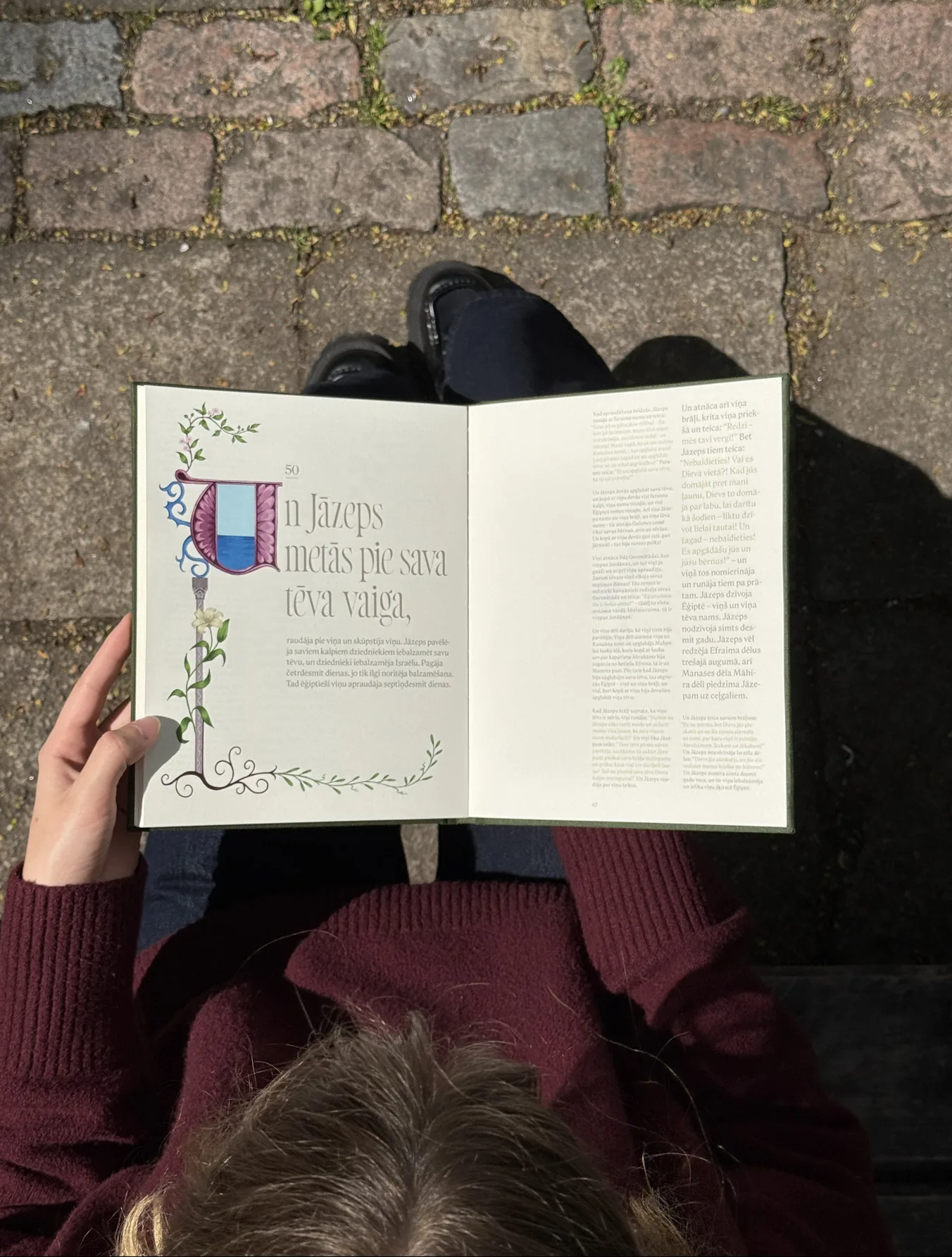
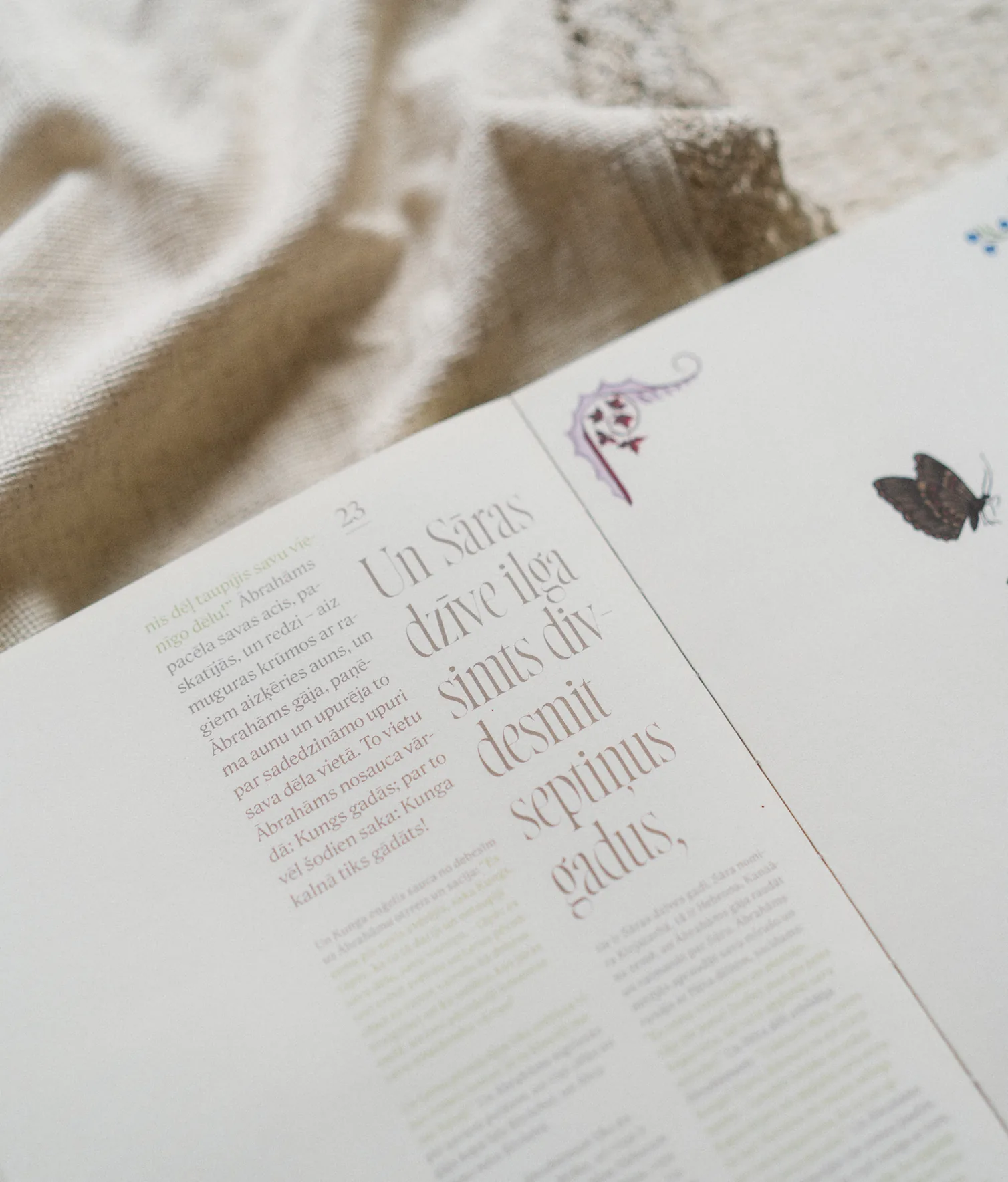
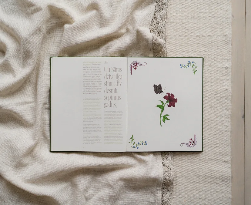
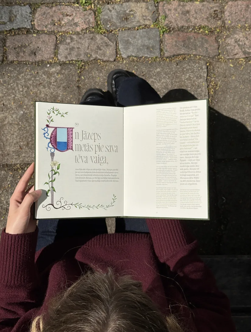
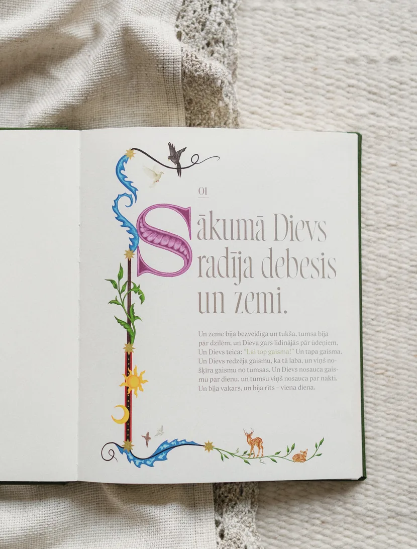
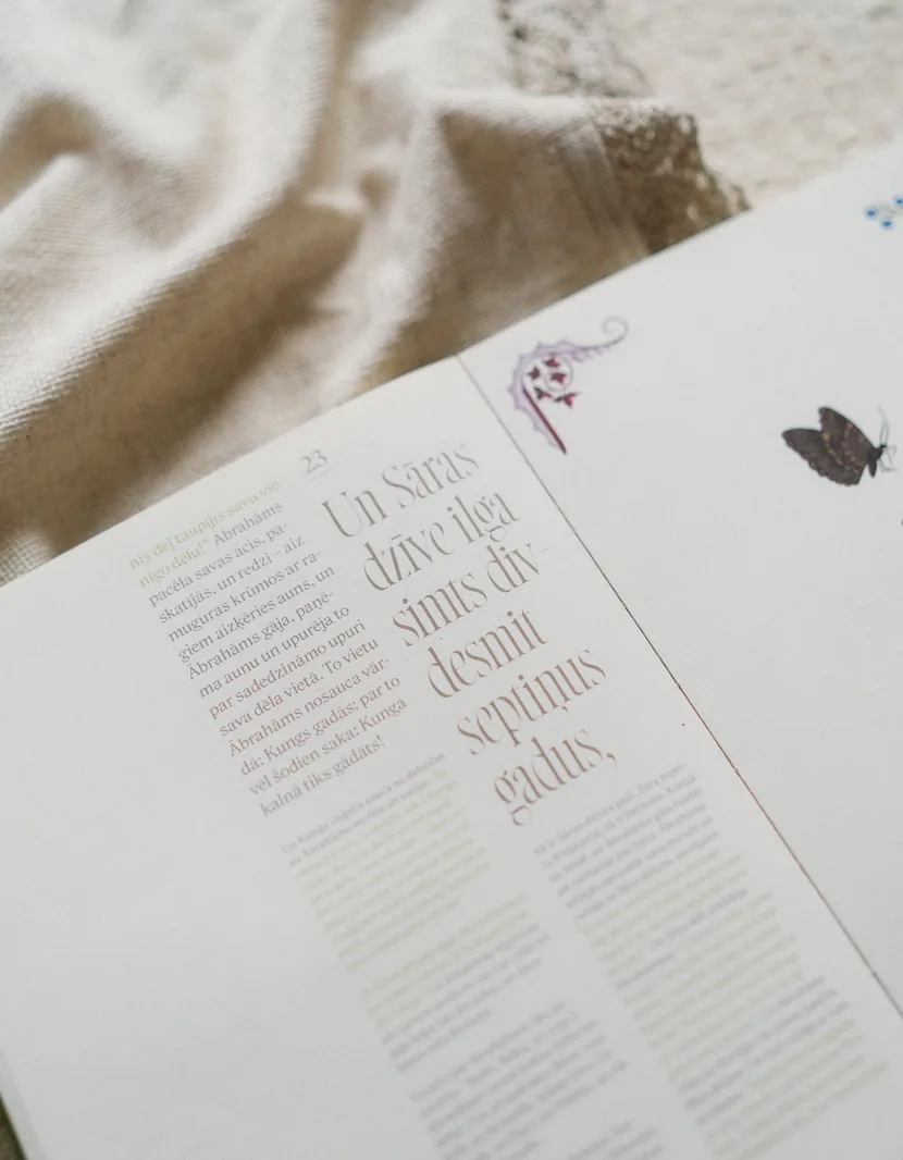
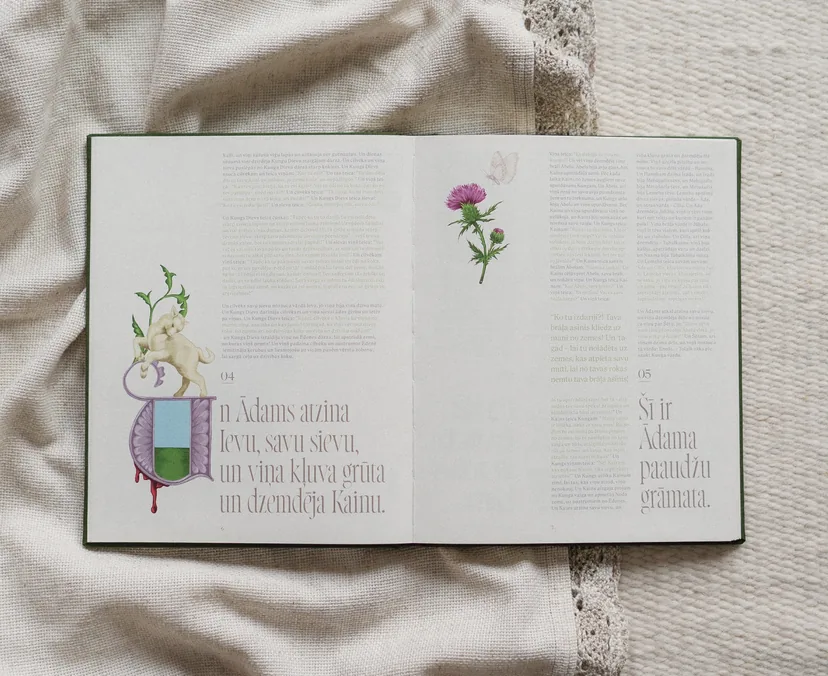
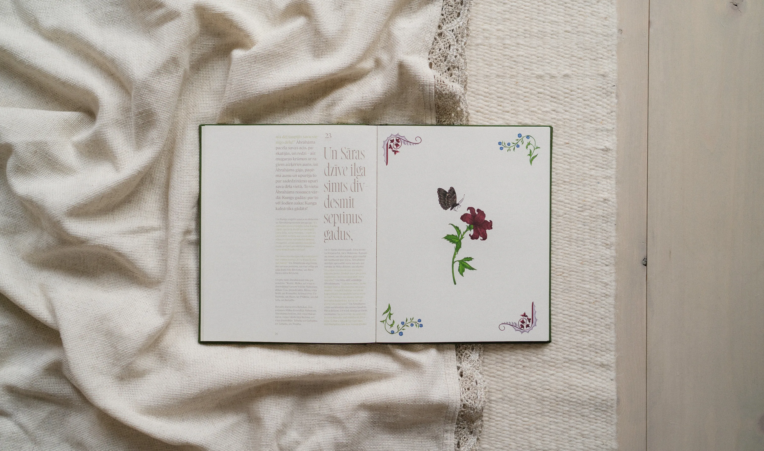
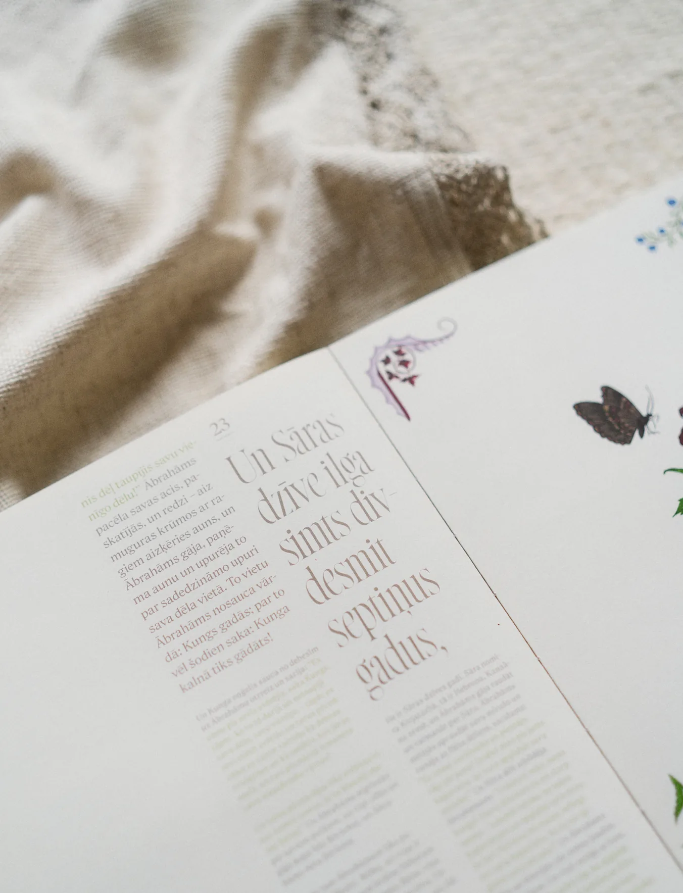
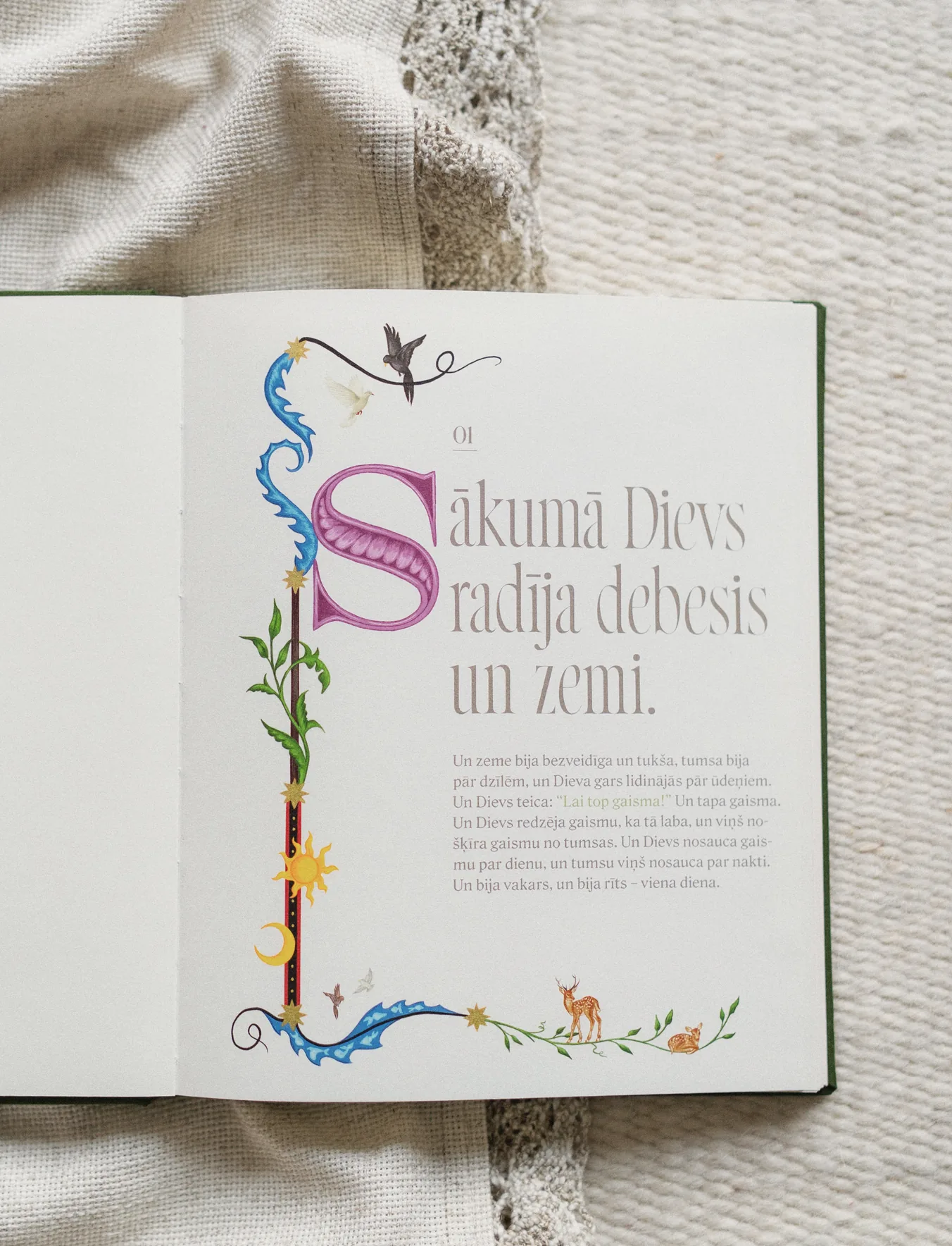
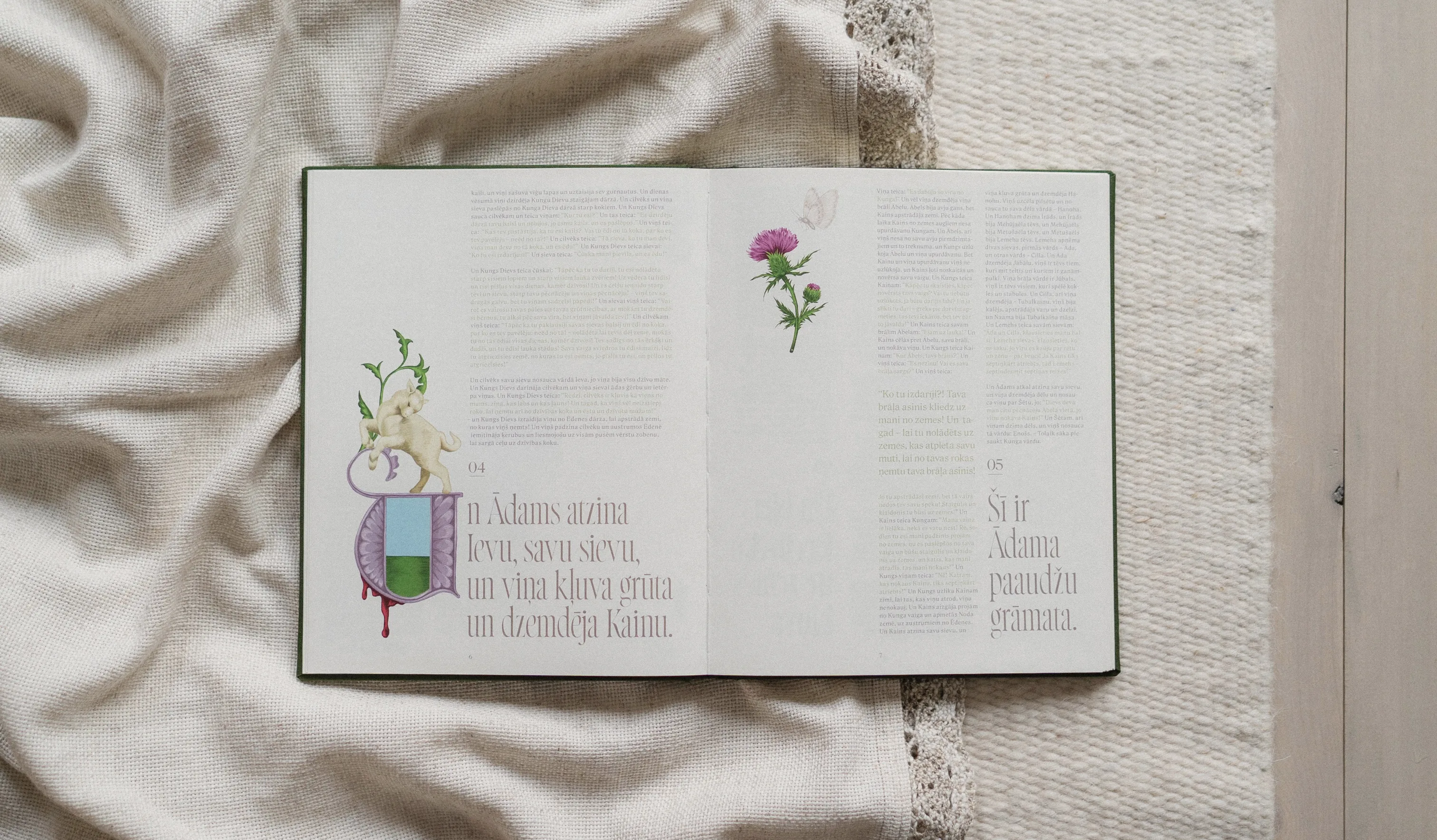
I chose a two-column layout, occasionally breaking it up with
single-column compositions. To stay closer to the manuscript
tradition, I left out chapter headings, subheadings and verse
numbers, allowing the text to flow without interruption. For the
body text, I chose “Roslindale”, a typeface with a subtle
resemblance to handwritten lettering. Chapter openings use
“Norman”, a condensed serif typeface that fits the narrow column
and gives the book a distinct visual identity.

Book of Genesis, image 4 Book of Genesis, image 8 Book of Genesis, image 13

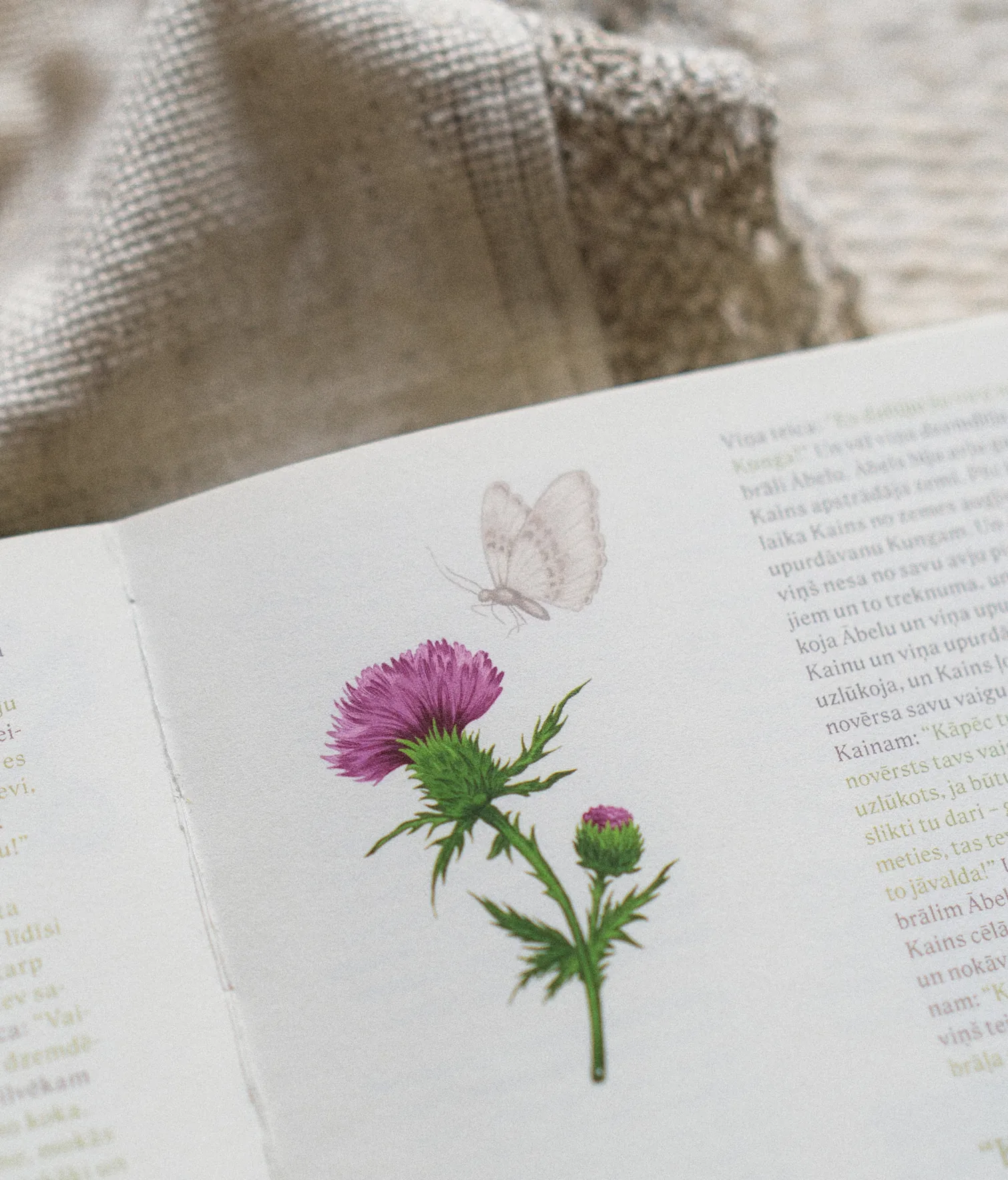
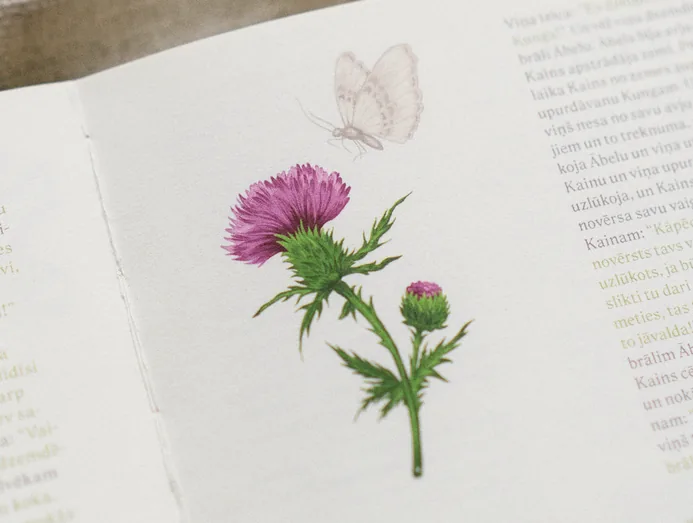
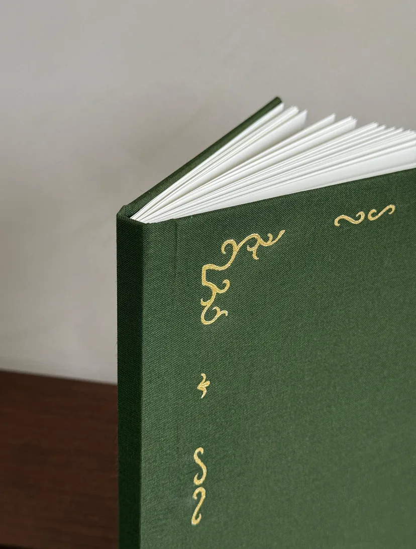
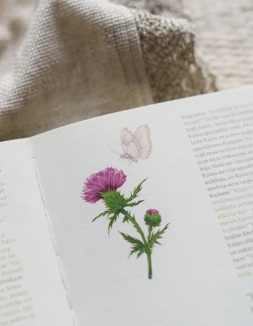
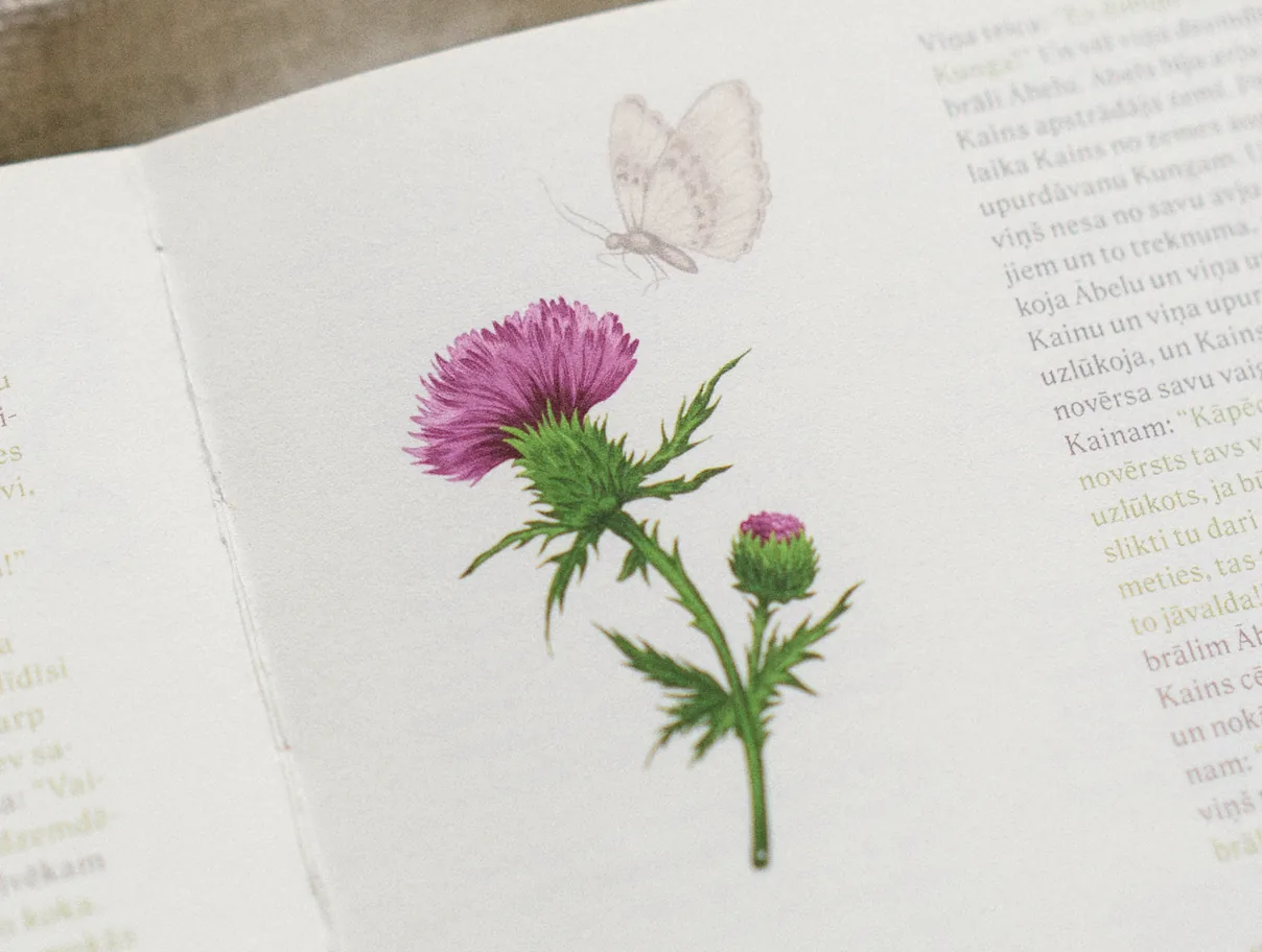
For the illustrations, I turned to Christian art and its use of symbolism to
communicate complex narratives through relatively simple visual elements.
I set myself a particular constraint, to depict only elements found in nature,
leaving out human figures and man-made objects. All illustrations were
created in Procreate.

Book of Genesis, image 3 Book of Genesis, image 7

Interpreting the Bible visually is not an easy task. There is always
the risk of crossing a line or misrepresenting something
meaningful to others. It was especially rewarding to hear from
readers that the work conveyed a genuine sense of respect and
affection for the text itself.

Book of Genesis, image 5 Book of Genesis, image 14

If I were to continue this project, I would like to shift some of the focus
away from illustration and explore other aspects of book design instead.
Typography, page composition, color. This would make it possible to
preserve the connection to manuscript traditions while developing an
approach that could work on a much larger scale.

Book of Genesis, image 2

Art Academy of Latvia / Semester project

Client

Academic advisor

Daniel Melse

2026

Year

LMA Design Days 2026 / Exhibition

Recognition

ARCHIVE JOURNAL CONTACT genesis, image 5

Book of Genesis

Is beauty a superficial distraction from
God's truth, or an essential dimension of
Christian worship? The intricate
ornamentation of medieval religious
manuscripts deserve more than a place in
history books. This project explores how
their centuries-old visual heritage can be
brought into a contemporary Bible edition.

genesis, image 6

Before starting to design, I spent time
exploring archives of illuminated medieval
manuscripts. I looked closely at their
typography, page layouts, ornamentation
and illustrations, gradually noticing certain
recurring features: narrow text columns,
ink-like gothic lettering and delicate
illustrations that used symbolism to convey
entire stories.
genesis, image 7 genesis, image 8

Psalter, England,
1310-1320

Book of Hours, Italy
15th century

genesis, image 10 genesis, image 9

Gutenberg Bible,
Germany, 1452-1455

I chose a two-column layout, occasionally
breaking it up with single-column
compositions. To stay closer to the
manuscript tradition, I left out chapter
headings, subheadings and verse
numbers, allowing the text to flow without
interruption. For the body text, I chose
“Roslindale”, a typeface with a subtle
resemblance to handwritten lettering.
Chapter openings use “Norman”, a
condensed serif typeface that fits the
narrow column and gives the book a
distinct visual identity.
genesis, image 1 genesis, image 11

For the illustrations, I turned to Christian art
and its use of symbolism to communicate
complex narratives through relatively simple
visual elements. I set myself a particular
constraint, to depict only elements found in
nature, leaving out human figures and man-
made objects. All illustrations were created
in Procreate.
genesis, image 12 genesis, image 13

Interpreting the Bible visually is not an easy
task. There is always the risk of crossing a
line or misrepresenting something
meaningful to others. It was especially
rewarding to hear from readers that the
work conveyed a genuine sense of respect
and affection for the text itself.
genesis, image 14 genesis, image 15

If I were to continue this project, I would
like to shift some of the focus away from
illustration and explore other aspects of
book design instead. Typography, page
composition, color. This would make it
possible to preserve the connection to
manuscript traditions while developing
an approach that could work on a much
larger scale.
genesis, image 16

Client:

Art Academy of Latvia / Semester project

Academic advisor:

Daniel Melse

Year:

2026

Recognition:

LMA Design Days 2026 / Exhibition

Usually, there's more going
on than meets the eye.