The Kardashev Scale, image 12

The Kardashev Scale

One day, my brother told me about the Kardashev Scale, and how our
future might extend beyond this galaxy if we progress on it. I found it
exciting and wrote down the title to research it later, but completely
forgot about it. Seven years later, I came across this note and finally
decided to look into it.
The Kardashev Scale, image 6

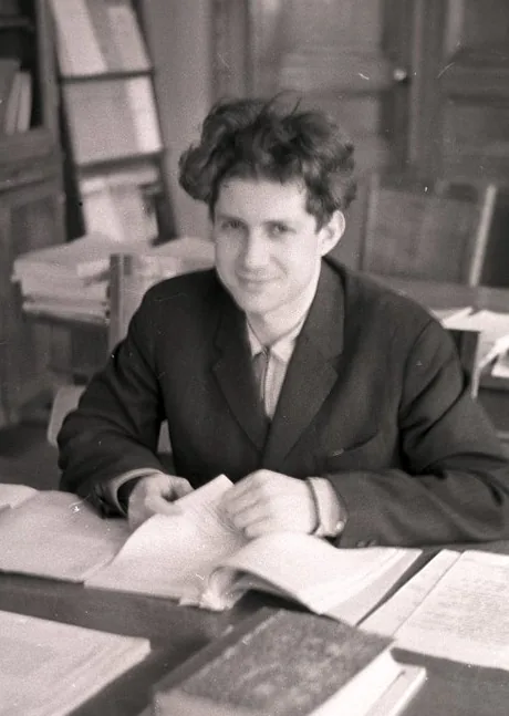
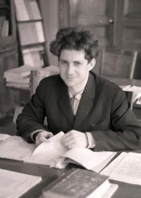
Named after Soviet astrophysicist Nikolai Kardashev,
who proposed the scale in 1964, it classifies
civilisations according to the amount of energy they
are capable of harnessing.

I became fascinated by the possibilities behind each
stage and spent a lot of time imagining what life might
look like as humanity progresses along the scale.
The Kardashev Scale, image 7

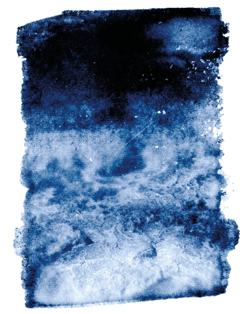
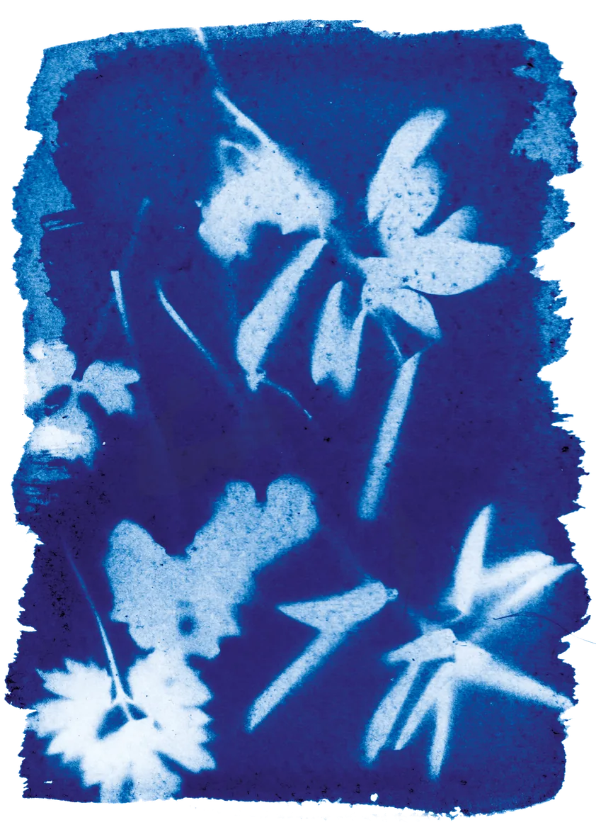
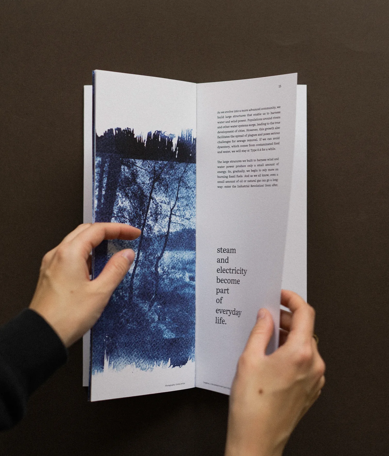
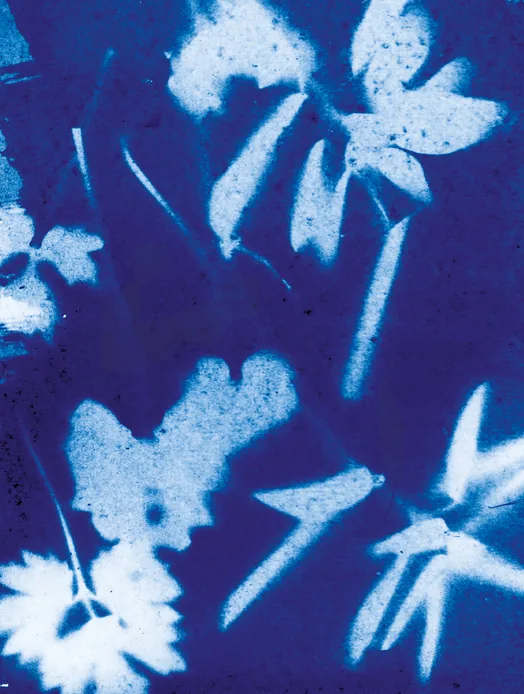
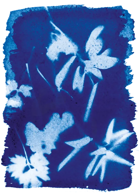
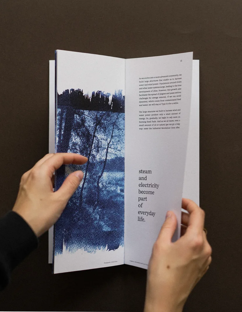
I wanted to use cyanotype for the visuals of this book.
Since it is a photographic technique that uses sunlight
to develop images, I thought it would work well with the
cosmic theme.

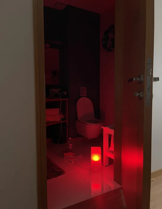
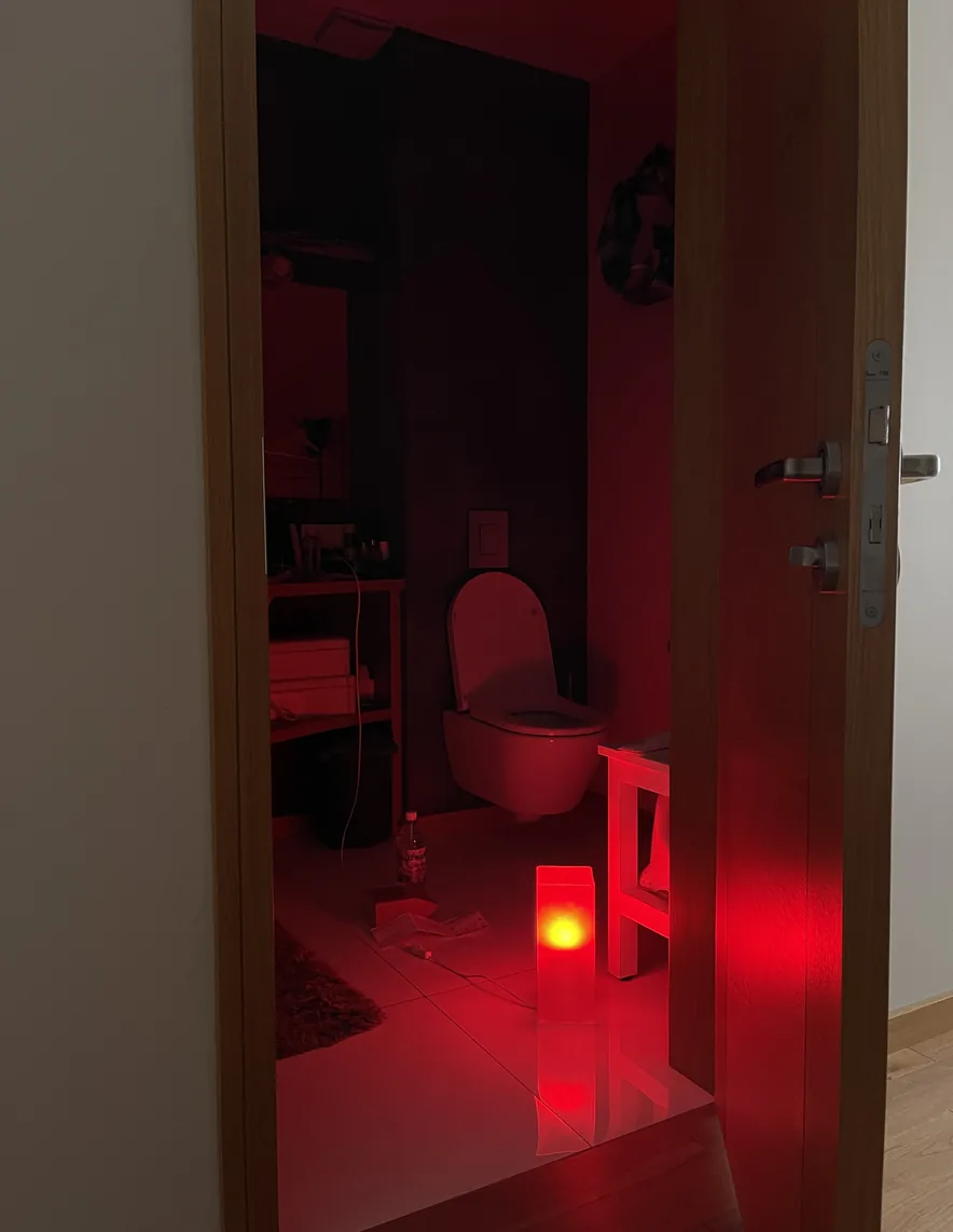
I turned my bathroom into a darkroom
and started to mix the chemicals.
The Kardashev Scale, image 8 The Kardashev Scale, image 11 The Kardashev Scale, image 10 The Kardashev Scale, image 9

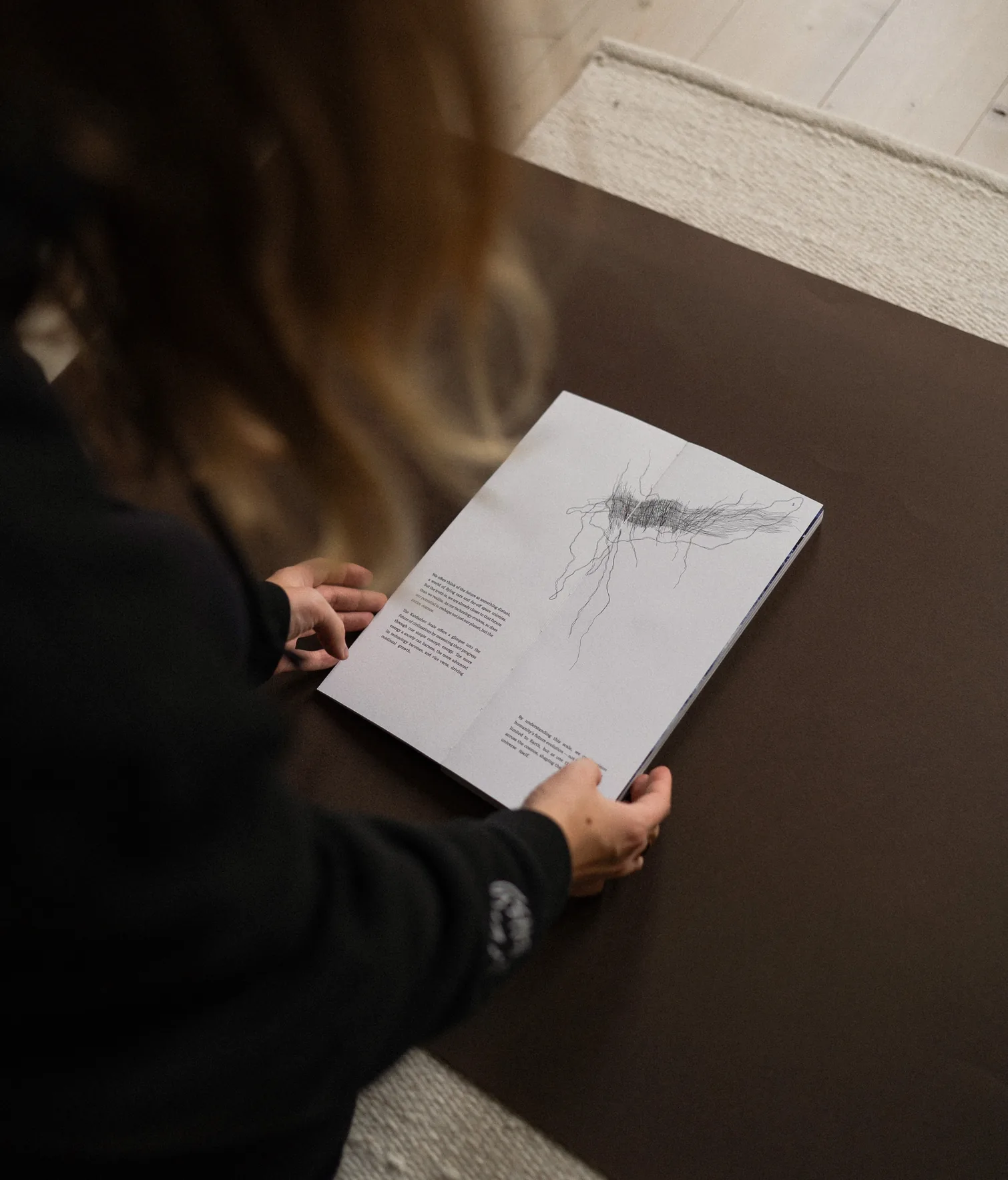
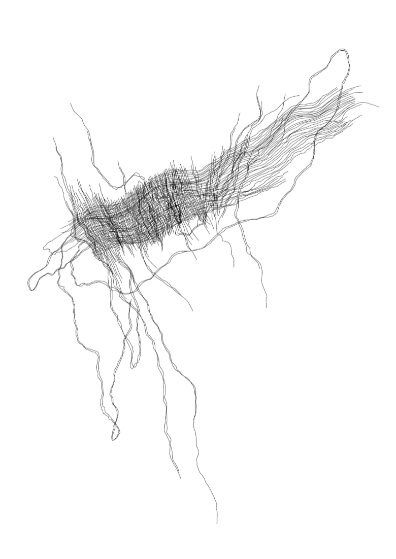
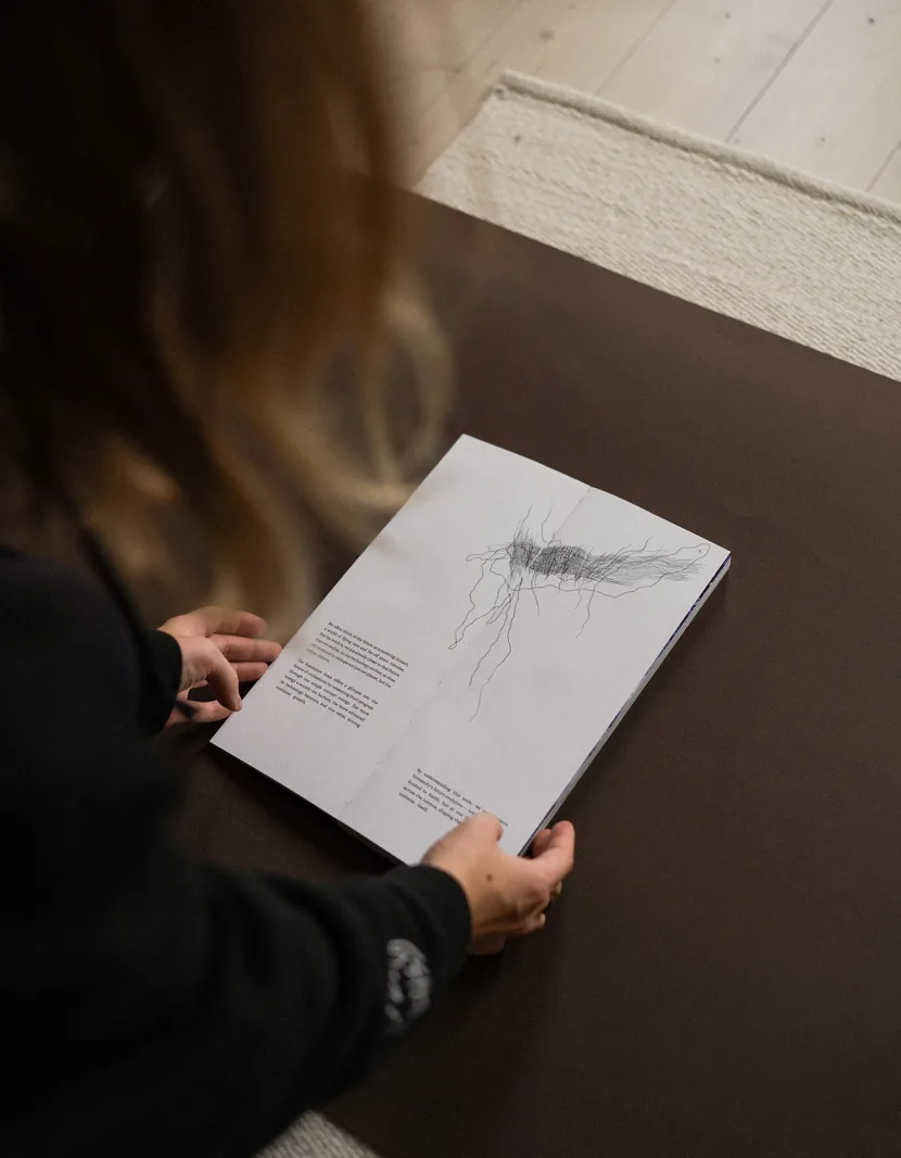
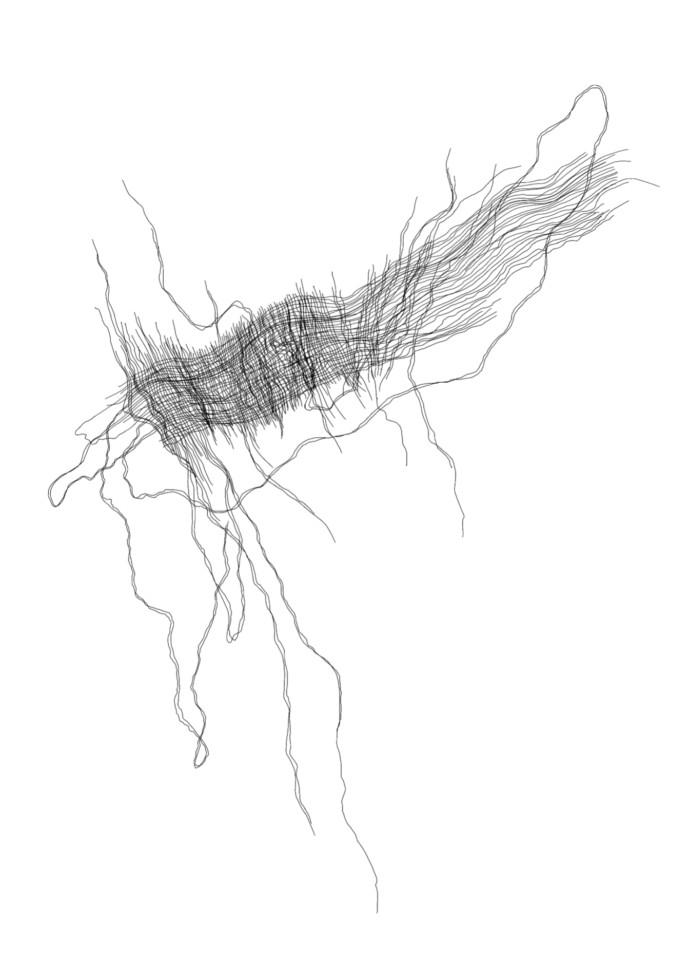
I combined the cyanotypes with pencil drawings, because I liked
the contrast between these two techniques: one relying only on
sunlight and the other involving a much more direct human touch.

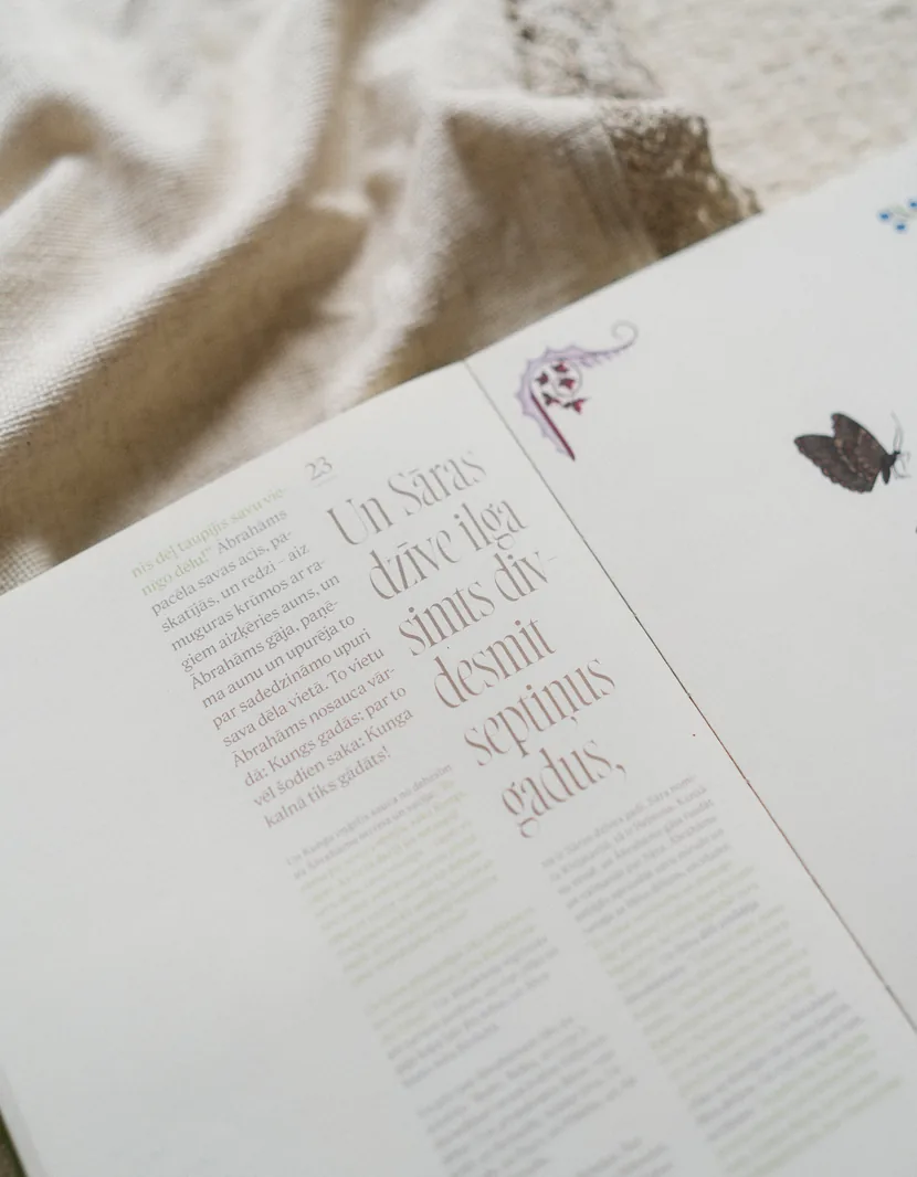
The book explores seven levels of civilisation, from planetary to
omniversal. As the concepts become harder to grasp, the layout and
illustrations become progressively more distorted and glitchy.

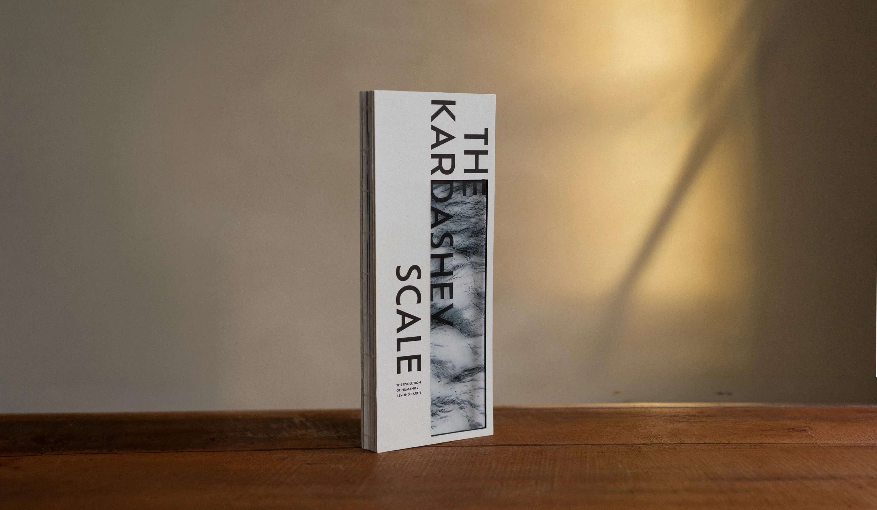
The Kardashev Scale, image 1 The Kardashev Scale, image 4

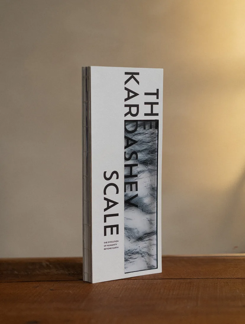
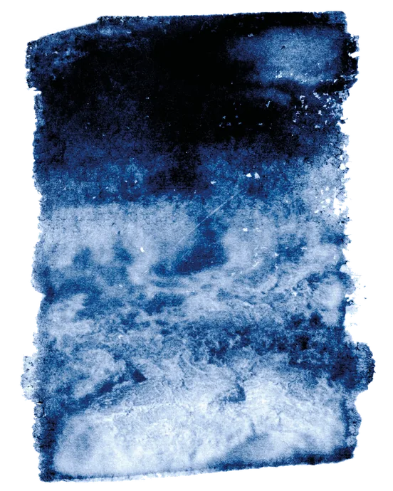
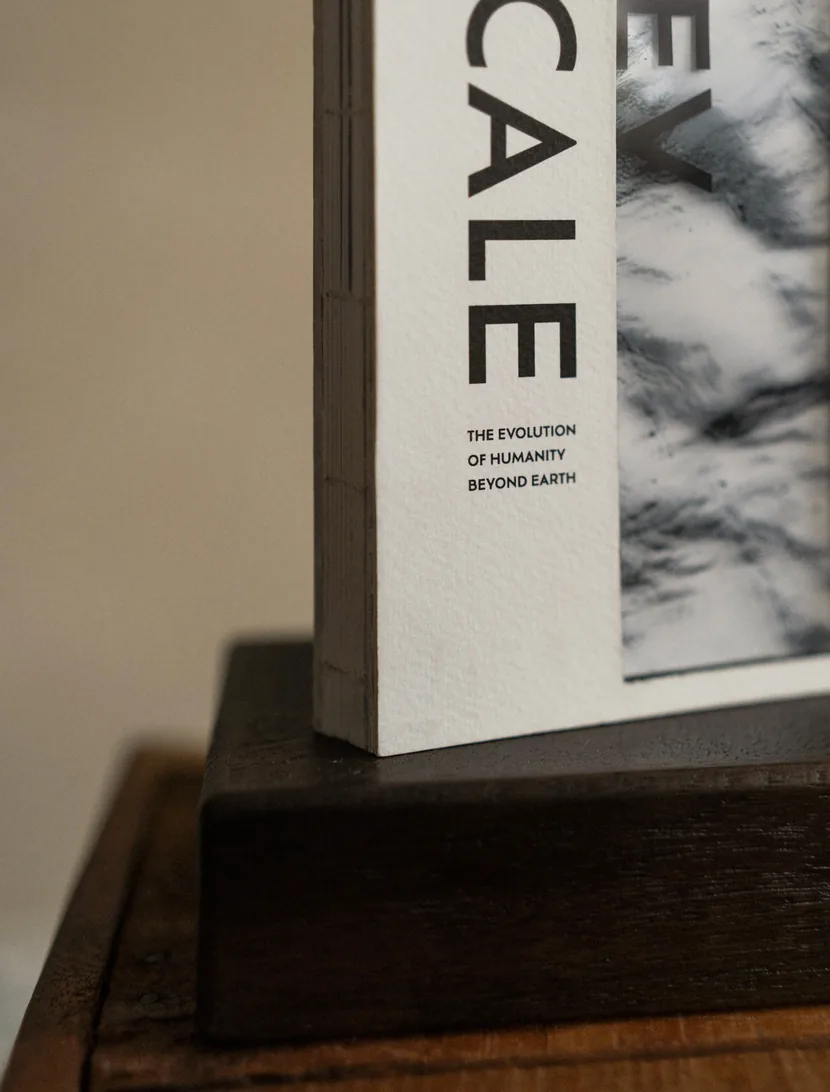
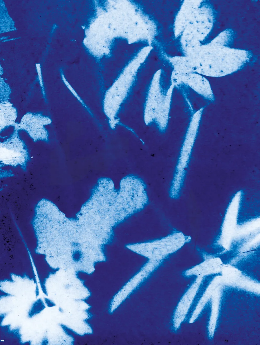
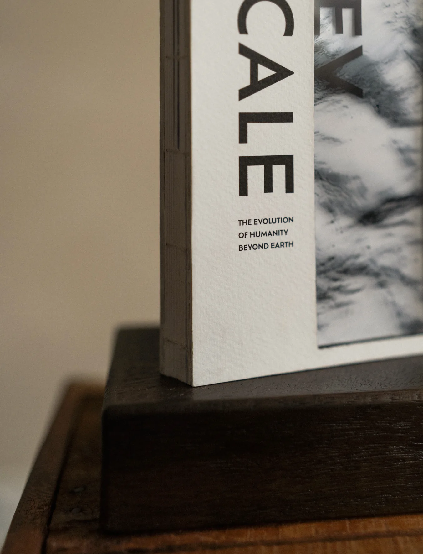
For the cover, I used one of the original cyanotype negatives.
I liked the idea of using something from the process itself
rather than creating a separate cover illustration. The
negative also offers a slightly different perspective on the
imagery found inside the book.

This project taught me to think about every little detail that
goes into making a book. There is so much more to it than
meets the eye, and I think there is bliss in the mystery of it.
There are things I don't want to explain. I want the reader to
notice them instead.

The Kardashev Scale, image 3 The Kardashev Scale, image 5

Art Academy of Latvia / Semester project

Client

Maija Rozenfelde

Academic advisor

2024

Year

Latvian Design Award 2025 / Finalist
Latvian Design Award 2025 / The jury's recognition
LMA Design Days 2025 / Exhibition

Recognition

ARCHIVE JOURNAL CONTACT kardashev, image 8

The Kardashev Scale

One day, my brother told me about the
Kardashev Scale, and how our future might
extend beyond this galaxy if we progress on
it. I found it exciting and wrote down the
title to research it later, but completely
forgot about it. Seven years later, I came
across this note and finally decided to look
into it.

kardashev, image 1 kardashev, image 6

Named after Soviet astrophysicist Nikolai
Kardashev, who proposed the scale in 1964,
it classifies civilisations according to the
amount of energy they are capable of
harnessing.

I became fascinated by the possibilities
behind each stage and spent a lot of time
imagining what life might look like as
humanity progresses along the scale.

kardashev, image 9

I wanted to use cyanotype for the visuals of
this book. Since it is a photographic
technique that uses sunlight to develop
images, I thought it would work well with
the cosmic theme.

I turned my bathroom into a darkroom
and started to mix the chemicals.
kardashev, image 10 kardashev, image 11 kardashev, image 12

The book explores seven levels of
civilisation, from planetary to omniversal.
As the concepts become harder to grasp, the
layout and illustrations become
progressively more distorted and glitchy.
kardashev, image 4 kardashev, image 3

For the cover, I used one of the original
cyanotype negatives. I liked the idea of
using something from the process itself
rather than creating a separate cover
illustration. The negative also offers a
slightly different perspective on the imagery
found inside the book.

This project taught me to think about every
little detail that goes into making a book.
There is so much more to it than meets the
eye, and I think there is bliss in the mystery
of it. There are things I don't want to
explain. I want the reader to notice them
instead.

kardashev, image 2 kardashev, image 7 kardashev, image 13

Client:

Art Academy of Latvia / Semester project

Academic advisor:

Maija Rozenfelde

Year:

2024

Recognition:

Latvian Design Award 2025 / Finalist
Latvian Design Award 2025 /
The jury's recognition
LMA Design Days 2025 / Exhibition

Usually, there's more going
on than meets the eye.